
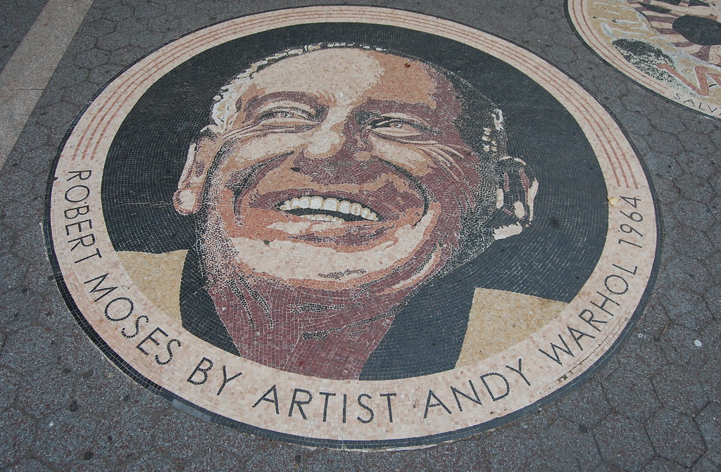
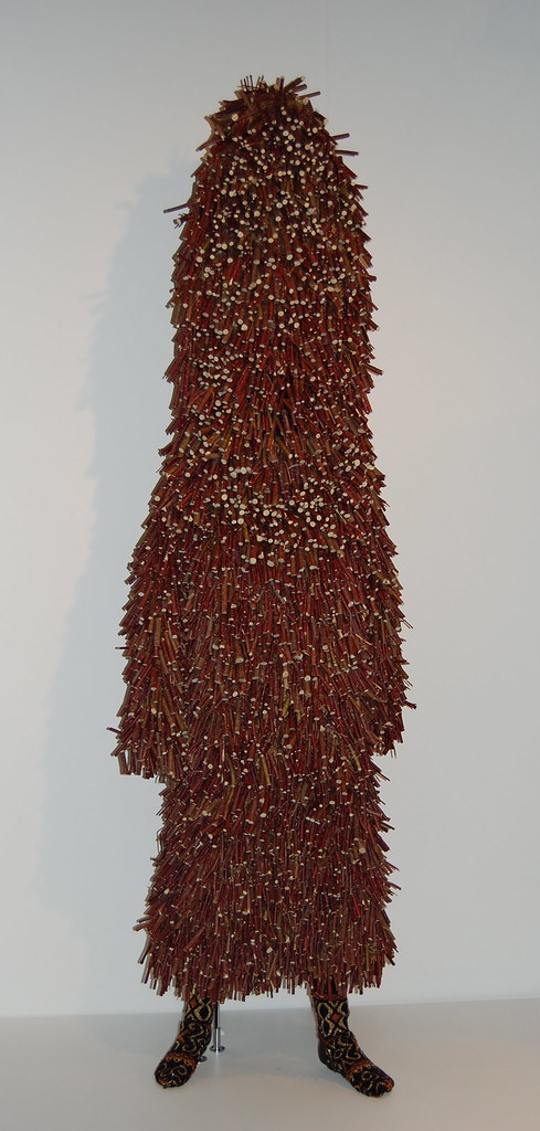
Mosaic in Passerelle Plaza, Flushing Meadows-Corona Park, Queens, New York. Photo: 16 Miles
August 23 Update: New York City Department of Parks & Recreation spokesperson Vickie Karp and John Krawchuk, the department's Director of Historic Preservation, have confirmed that the mosaics were installed about ten years ago and were restored last year. Mosaic maker Michael Golden was the design consultant on the project. I have spoken with Mr. Golden, and there will be more details to follow soon.
_____
This is a weird one. Walking through the Flushing Meadows–Corona Park in Flushing, Queens, over the weekend, I came across this mosaic not far from the new Mets stadium. It's New York City parks commissioner Robert Moses (the hard-charging bureaucrat investigated in Robert Caro's devastating biography, The Power Broker), as depicted by Andy Warhol. But it's not that simple: Warhol's silkscreened portraits of Moses are believed to have been lost or destroyed, the mosaic may have been installed in 1998, and the image ties into a much more complicated, infamous episode in the Pop artist's career. First, some quick background information.
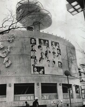
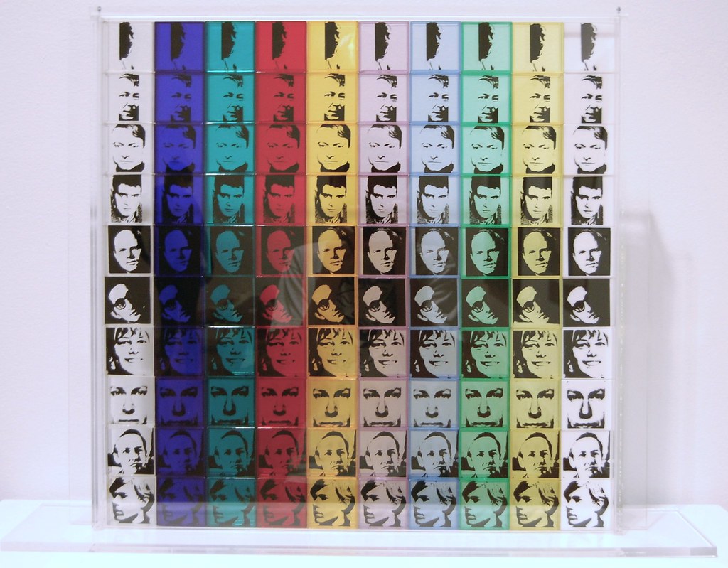
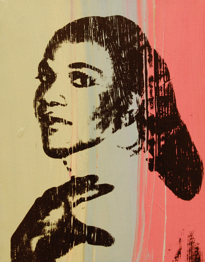
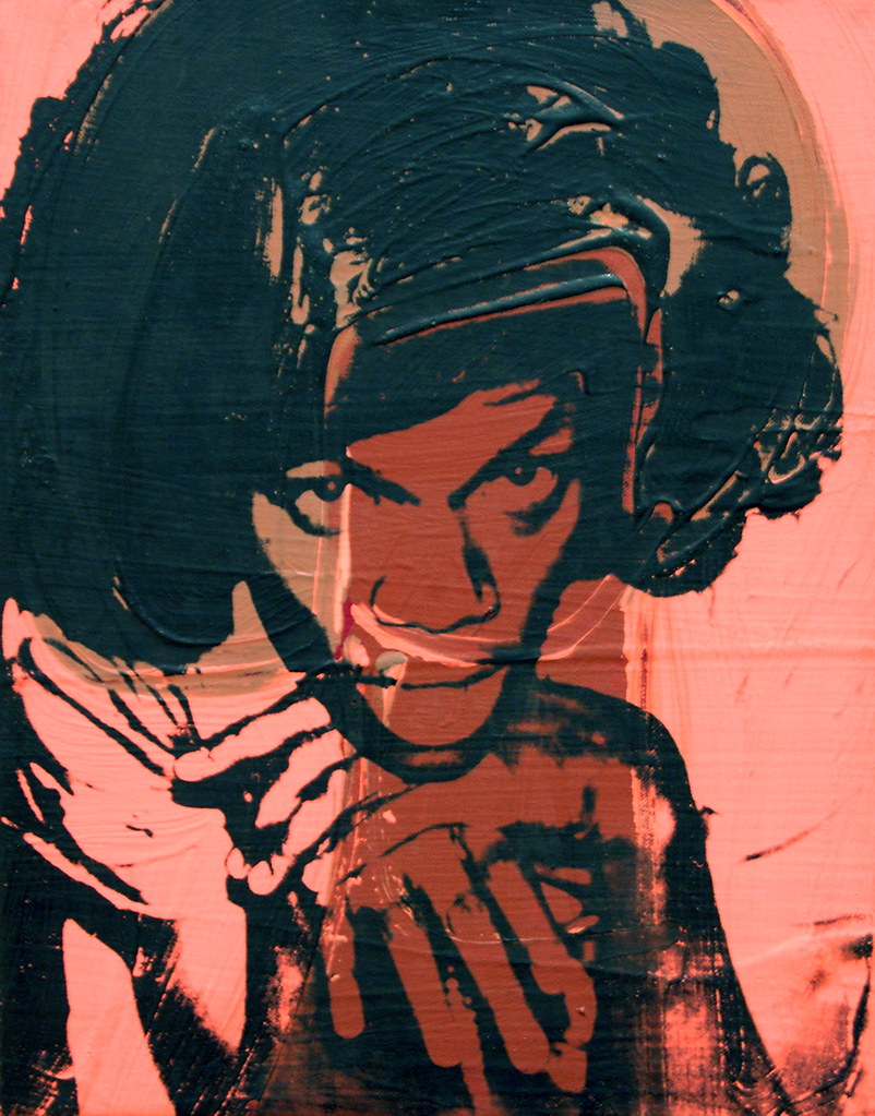
Andy Warhol, Thirteen Most Wanted Men, 1964. Silkscreen ink on Masonite, New York World's Fair, 25 panels, each 48 x 48 in., overall 20 x 20 ft.
For the 1964-65 New York World's Fair (one of Moses' pet project), architect Philip Johnson was hired to design the New York State Pavilion and commission 10 artists to create work to decorate its exterior. He asked Warhol to participate, and the Pop artist responded by creating Thirteen Most Wanted Men (1964), a large mural with photos of criminal suspects collected by the New York City Police Department. However, before the fair opened, someone asked Warhol to remove it, and he had it covered with silver paint. As Richard Meyer writes in his remarkable 2002 book, Outlaw Representation, no one could quite agree about what happened. Here is a quick rundown of explanations from various people, via Meyer:
- Initial reports claimed that Warhol himself asked for the work to be removed. The Times reported that "he did not feel that it achieved the intended artistic effect," citing Johnson for that explanation. In the Herald-Tribune, Warhol's gallerist (Eleanor Ward, whom he would soon leave for Leo Castelli) concurred: "Andy just didn't like the way it looked," she said. Warhol, for the record, is not quoted in the article.
- A few months later, the Times quoted Warhol saying that the mural was removed because some of the men in the photographs had been "pardoned," and there was a fear of a lawsuit coming from one or more of them.
- In 1970, Johnson told art historian Rainer Crone that New York Governor Nelson Rockefeller was concerned that most of the men were Italian, making the mural less than politically palatable. In addition, because some of the men had been exonerated, "we would have been subject to law-suits from here to the end of the world," he said.
More likely, Meyer argues, politicians (probably Moses or Rockefeller or both) could not accept reputed criminals being presented at a fair that was supposed to reflect the glory of New York, the United States, and the future. And then there is, of course, that matter of the group of men being described as "most wanted," a description that is rife with homoerotic implications.
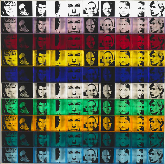
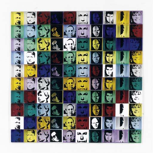
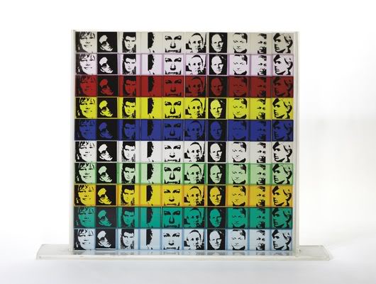
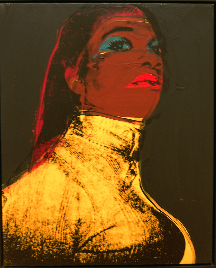
Warhol had a novel solution to the censorship, proposing the creation of a new mural with 25 portraits of Moses, replacing the desired men with the bureaucrat that may have blocked their appearance at the fair. Warhol produced a few trial silkscreens all of the silkscreens, though Johnson vetoed the idea, saying later that "taking potshots at the head of the fair would seem to me very, very bad taste." The image below is an extant photograph of one of those trial portraits. August 23 Update: Former Warhol associate Mark Lancaster wrote in, saying that he helped the artist print all 25 portraits of Moses. He also photographed the works.
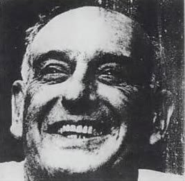
Andy Warhol, Robert Moses, 1964. Synthetic polymer paint silkscreened on canvas.
Thanks to the magic of Google Books, and its archive of old Life magazines, it seems safe to say that Warhol used a photograph of Moses that ran in a 1962 profile of the parks commissioner in Life. (Warhol used a mirror image of the bureaucrat: the original from the magazine is below.)
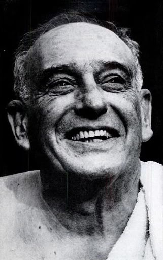
Photograph of Robert Moses from "Disputatious Dirt-Mover," Life magazine, October 5, 1962
With that history in mind, the Flushing Meadows mosaic looks even more bizarre. The anonymous artisan responsible for the work (the Parks Department is looking into who made them) made the rather unorthodox choice of using Warhol's lost, censored mirror image to (at least ostensibly) pay tribute to Moses and the World's Fair. However, labeling it a "Warhol" is a bit of a stretch since the artist had no involvement in the work: it's really just a mosaic of a mirrored photograph from Life. That said, one does suspect that the mosaic maker knew the story, particular since he or she bothered to dig up an image of Warhol's lost Moses portrait. Also, look back at the mosaic at the top of this post: Moses' mouth has been enlarged to a comic scale. He looks balder and fatter than in the Life photograph, just a little bit unhinged. Is it intended as a satirical caricature, a pro-Warhol critique masquerading as an innocuous piece of public art? What is going on here? (Also, it seems worth noting that there is a very real risk that visitors to the park, unaware of Moses' possible role in censoring Warhol, may take the portrait as a legitimate celebration of the autocratic fair director, though one hopes not.)
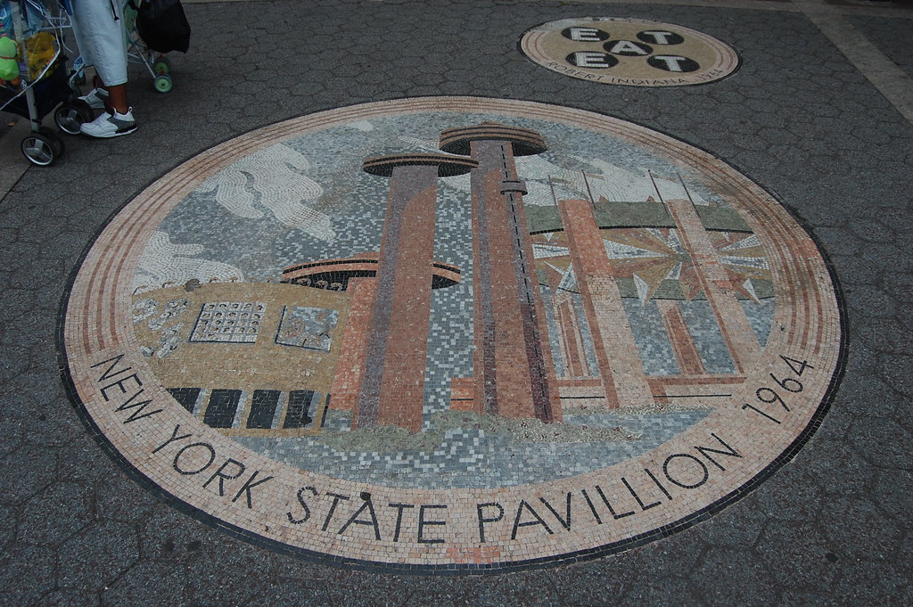
Mosaic in Passerelle Plaza, Flushing Meadows-Corona Park, Queens, New York
Just in case that wasn't strange enough, another mosaic depicts Johnson's Theaterama, the part of the New York State Pavilion that was decorated with the ten artists (more on that later). Yes, Warhol's Thirteen Most Wanted Men seems to be depicted, even though it was painted over before the start of the fair. (It was subsequently covered with a tarp and later removed). It shows the 1964 World's Fair as it never officially looked. Rather, it is an imagined, idealized vision of a fair without censorship and of a society that was willing to accept Warhol's men.
If you made the mosaic or know who did, please send me an email. I would love to speak with that person (or those persons). Thank you!

The Queens Theatre-in-the-Park, formerly the New York State Pavilion's Theaterama


