Showing posts with label 2006. Show all posts

Monday, May 2, 2011

Dennis Oppenheim at a Train Station in the Bronx


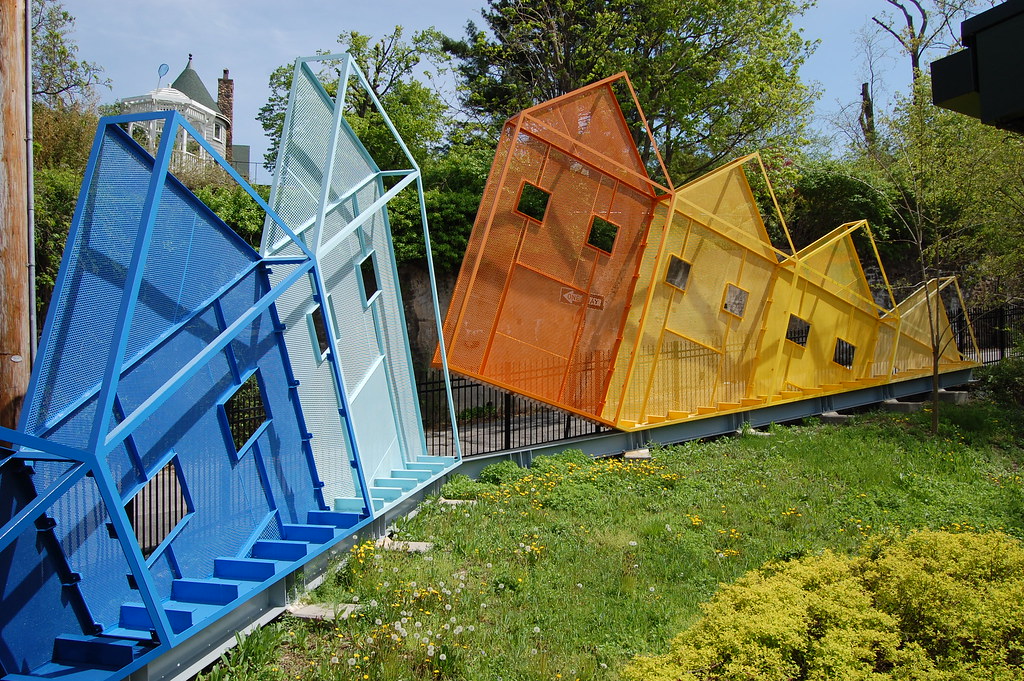
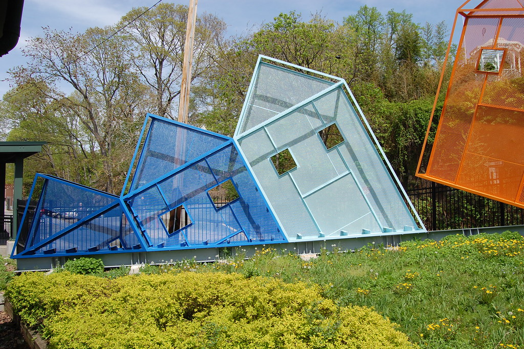
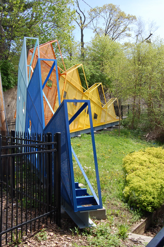
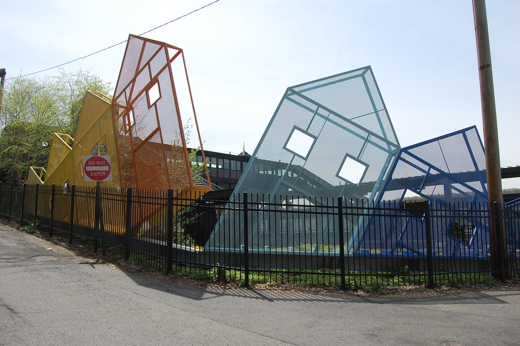
Dennis Oppenheim, Rising and Setting Neighborhood, 2006. Painted steel, perforated steel, 22 ft. x 2 ft. x 80 ft. Photos: 16 Miles [more]
"Some warm June night this summer I will wander down to TriBeCa and wait for Dennis to run past me in the night — the outlaw bad-boy artist no one can catch."
– Alice Aycock, Artforum, May 2011


While perusing Dennis Oppenheim's web site in the days after his death in January, I was surprised to learn that he had completed a work of public art at the Metro North train station in the Riverdale section of the Bronx less than five years ago. Somehow, despite riding past that station numerous times, I had completely missed it. Spurred by the tribute penned by his second wife, Alice Aycock in this month's Artforum, I visited the work, Rising and Setting Neighborhood, 2006, over the weekend. It is an odd and beautiful piece, though not as odd and beautiful as some of Oppenheim's other public art pieces. (One can only get away with so much in genteel Riverdale, I assume.)


"The piece evokes the houses of the neighborhood in the light of daybreak and dusk," Oppenheim wrote of the piece. "It greets commuters as they begin their journey leaving in the morning as the sun rises, returning in the evening with the setting sun." I buy all of that, but, as is almost always the case with the Oppenheim's public work, there is another, more sinister, darker element. The houses have an anthropomorphic feel: note the two square eyes and the large square mouth. They may be greeting commuters, as Oppenheim said, but they are not the friendliest ambassadors. They are not smiling. Rather, their mouths are wide open, as if they're screaming or shouting. "Don't leave!" At the same time, they're painted with a family friendly range of colors, and they could be just seven separate, irregular pentagons.


I only met Oppenheim once, for a few minutes, last year at the opening for "The Original Copy" exhibition at the Museum of Modern Art, which featured his 1970 work Parallel Stress. Never one to approach an artist I don't know, but having just finished reading Lucy Lippard's Oppenheim–filled Six Years, I decided to say hello after spotting him just outside the sculpture garden. After offering some sort of awkward congratulations, I showed him the book, which he started flipping through, ostensibly excited (though it occurs to me now that he may have just been generously indulging the curiosity of a fan). He stopped on a page with a photograph of Robert Kinmont doing one of his 8 Natural Handstands (1969) — a possible influence on Parallel Stress, in the way that it combines bodily performance and photographic documentation — and said something to the effect of, 'This was a great piece, but he stopped making art shortly after this and just disappeared. These photographs and a few works were all that was left.' Which is where we now find ourselves in regards to Oppenheim.


Thankfully, he has left us with a fascinatingly idiosyncratic body of work, much of it public art that we'll be able to stumble onto for some time to come. Here is a quick roundup of other writers' responses to his passing.

In the Guardian, Michael McNay positions Oppenheim in relation to his peers and followers:
"It might have been expected that the grand calmness of Oppenheim's earth art would lead to sculpture somewhat akin to Rachel Whiteread's understated monumentality, but instead he seems to have followed the example of Claes Oldenburg's monumental pop sculptures of everyday objects and the tainted route of Jeff Koons's urban vulgarity."
Jerry Saltz shares what he found compelling about the artist's work:
But the wild, labyrinthical ways Oppenheim put things together, the way he allowed thought to unspool ever-outward in involuted configurations, was inspiring nonetheless. His ideas of artistic experimentation, theoretically driven art, the merging of sculpture and science, his absolute unwillingness to create a visual style, his aesthetic and material dislocation — all of it wowed me.
Roberta Smith connects his early, ephemeral work to his later, more grandiose efforts (and has a few anecdotes, which are delightful to read):
"Belonging to a generation of artists who saw portable painting and sculpture as obsolete, Mr. Oppenheim started out in the realm of the esoteric, the immaterial and the chronically unsalable. But he was always a showman, not averse to the circuslike, or to courting danger."
Judd Tully remembers almost being killed by an Oppenheim piece:
"I managed to escape with a pack of coughing scribes through an emergency exit just before a retinue of fire equipment and fire fighters arrived to save the day. Oppenheim somehow avoided arrest for what seemed to be an exceptionally dangerous happening-slash-performance. As he said later, 'It wasn't supposed to be so much like Vietnam.'"
Finally, one more line from Aycock:
"Dennis was a trickster, a shape-shifter, a flimflam man, a snake-oil salesman for art, and a rascal. He was highly intelligent, charismatic, and witty."

Thursday, February 26, 2009

An Unruly History of the Readymade at the Jumex Collection [Review]


Richard Pettibone. Photo courtesy of fishercott.

[Part 1 of our ongoing feature on contemporary art in Mexico City]

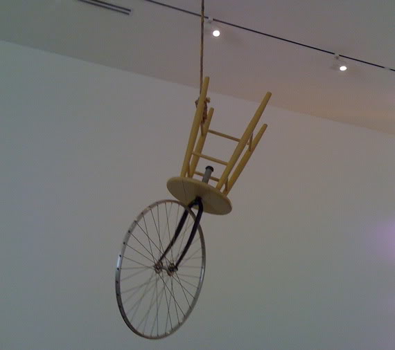
I had never witnessed a piece of art being put to death before. Walking into An Unruly History of the Readymade at the Jumex Collection, though, it’s the first thing one sees. Marcel Duchamp’s notorious Bicycle Wheel (1913) has been slid through a noose and hung from the ceiling of cavernous warehouse. Consulting my guide, I learned that it was actually a sculpture by serial reproducer Richard Pettibone.

Laid out on the floor as a gigantic chessboard that spirals chronologically toward the center of the room, the show (organized by Tate Modern curator Jessica Morgan) comprises about 100 works culled from the collection of juice scion Eugenio Lopez, presenting interpretations of Duchamp’s act of selection that range from the ludic to the staid, the hilarious to the banal.


Ugo Rondione, Love Invents Us, 1999.

Given the sheer abundance of ideas that have been attributed to his work, it’s no surprise that the breadth of artists included in the rambling survey is enormous. A Warhol Jackie (Pettibone’s miniature copy is in a vitrine a few feet away) is hung a few spaces from On Kawara date paintings (with Mexico City newspapers included, of course). Elsewhere, artists like Johns, Jonathan Horowitz, Kippenberger, Kelley Walker, Elmgreen & Dragset, and Jim Hodges are present. Damian Ortega, Abraham Cruzvillegas, Sofía Táboas, and Gabriel Kuri form a portion of the Mexican contingent. (Interestingly, they’re all represented by Kurimanzutto, for which Mr. Lopez seems to have a particular obsession.)


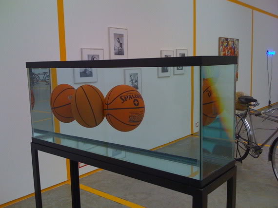
Jeff Koons, Three Ball Total Equilibrium Tank, 1985. Photo courtesy of fishercott.

Sturtevant’s meticulously replicated Johns painting represents the appropriation wing of the party, suggesting the choice of object could actually be another work of art. Warhol’s inclusion foregrounds the readymade as commercial image, Jackie Kennedy’s face plucked from a page in a newspaper. Rirkrit Tiravanija’s polished cooking equipment and its carrying case (shades of Boîte-en-valise) pursues the readymade into every day life, selecting a relational moment instead of a hat rack as the art. Cataloguing the complete set of readymade possibilities would yield scores of factions.

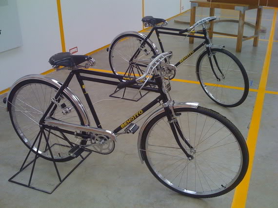
Maurizio Cattelan’s piece Dynamo Secession (1997) is where I paused for the first time, suddenly shaken out of my art history reverie. Twin bikes that can be pedaled to power a light bulb, he reanimates the bicycle wheel, as Duchamp did originally (“In 1913 I had the happy idea to fasten a bicycle wheel to a kitchen stool and watch it turn,” “Apropos of Readymades,” 1951.) It’s cute but also sinister. Simply lighting a bulb in a gallery already flooded with light, it uncomfortably highlights the self-referential (self-reverential) discourse at play. For a lot of people outside the hermetic seal of contemporary art, the readymade represents the moment that modern art became incomprehensible.


Maurizio Cattelan, Dynamo Secession, 1997. Photo courtesy of fishercott.

At the very center of the space, the final work is a banana skin tossed on the ground. Authored by Adriana Lara, the peel is replaced every day after someone from the museum consumes a banana. We can spot the references (to Warhol’s Velvet Underground & Nico cover and the food happenings of relational aesthetics) and get the joke. It may be too easy. The obsessive repetition of its production mirrors Cattelan’s piece. Put another way, we’re just spinning our wheels. There’s a tremendous amount of great, sublime, perplexing work here, and the show is generally crisply edited. There’s also a real danger of falling into a theoretical mise en abyme.

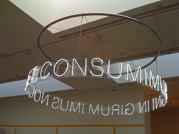
Overhead is a sculpture by Cerith Wyn Evans, a neon text (In Girum Imus Nocte et Consumimur Igni, “We enter the circle at night and are consumed by fire”) spun into a halo. It’s an ancient Latin palindrome, used by Guy Debord for the title of his final film. One thinks of one of the final lines from that film of 1978: “This civilization is on fire; the whole thing is capsizing and sinking.” It will take more than banana peels to confront that.


Cerith Wyn Evans, In Girum Imus Nocte et Consumimur Igni, 2006. Photo courtesy of fishercott.

An Unruly History of the Readymade
Via Morelos 272, Col. Sta. Maria Tulpetlac, Ecatepec
Through February 2009

Wednesday, December 17, 2008

[Top 10 of 2008] #5 - Schweiz über alles at La Fundación/Colección Jumex


Entrance to the Colección Jumex.

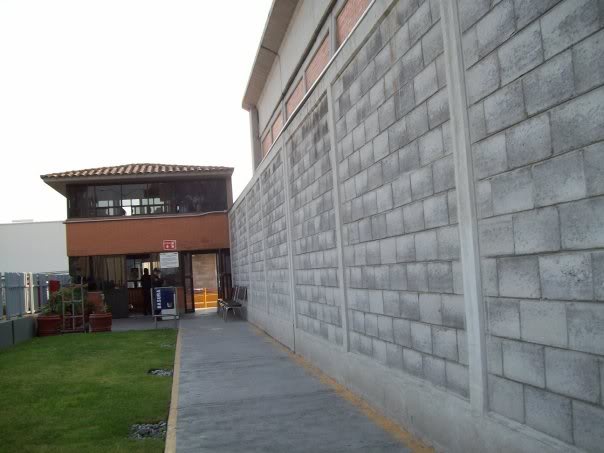
Colección Jumex is located within the factory of the eponymous juice company, a bunker on the edge of Mexico City, accessible only by taxi. Before sliding open the metal walls blocking the entrance, security guards question you and check your identity.  It's open only via appointment and walled off from the congested streets of the DF.  To put it another way: it would be hard to imagine a white box purer than this.  (In our two-hour stay, we saw only two other visitors.)


Ugo Rondinone, Love Invents Us, 1999, neon, Perspex, transluscent film, aluminum, 310 x 721 x 10 cm.

Above the concrete block walls, a Rondinone sign.  Within the walls of corporate Mexico on top of La Fundación Jumex's storage facility, its admixture of sincerity and irony had never seemed so perfect.


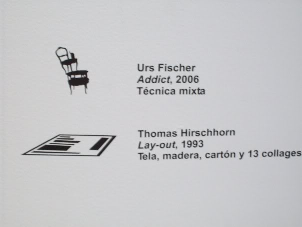
Clever, adorable labels with little icons identify each work.

It was a smart presentation of pleasurable favorites with a needlessly incendiary title. Focusing solely on the Swiss artists in the collection, it presented a simple thesis well: the days of nationalist art are long over, washed away by an entrenched globalism, at least within the art markets of Chelsea, Berlin, and London.


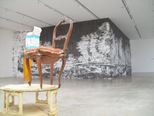
Front: Urs Fischer, Addict, 2006, mixed media.
Back: Ugo Rondinone, Where Do We Go from Here?, 1996, ink on wall, playwood, yellow neon, 4 DVDs, 4 projections, 500 x 1200 x 1000 cm.


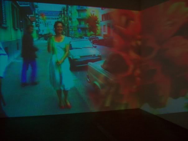
Pipilotti Rist, Ever Is Over All, 1997, video installation, dimensions variable.

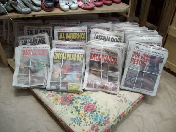
Any exhibition that features Pipilotti Rist's video of a Dorothy-figure wandering down the street, smashing car windows, and smiling to police officers will instantly earn my affection, but there were other charms as well: little icons identifying the art on display and an installation in the offices upstairs by a Mexican artist named Moris, which required you to climb a ladder and jump a wall, dodging barbed wire.  Containing tabloids filled with stories of gang violence and organized crime, it injected the reality outside the pristine walls into the center of the collection.


Moris, Hermoso paisaje No. 5 (el baldio), 2008, installation.


Free, delicious Jumex beverages are available for all visitors.

The real joy, admittedly, had to do with the exclusivity of the affair, viewing art that only a few are likely to see in an environment that - however ridiculous, elitist, and cloistered - would be hard to improve upon.  The young employees were tinkering happily with a recently-acquired video work; there were free drinks (Jumex-brand, clearly), a gargantuan research library (in which sat a full set of Artforums, their bindings seductively cascading along the shelves), and a seemingly limitless supply of art (attested to by the stacks of burgundy, catalogue binders filling the offices).  

Monday, January 15, 2007

Defending Matt Greene

Deitch Projects was recently showing works by Matt Greene in an exhibition entitled Surrender! that I think warrants notice. (It just closed, but you can check out most of the works at the Deitch site.) If you look at the paintings for a few seconds, you're probably not surprised that Roberta Smith is pissed. She says:
"They seem conservative, thin and calculated to appeal to young, straight, male hedge-fund managers with a yen for lap dances and a taste for magazine illustrations from the 1960s."
First of all, all young, straight, males have a "yen" for lap dances. I don't think that should really be held against them. Second, what young hedge fund managers have a "yen" for 1960s magazine illustrations? I mean, I'm sure some do, but is that really a viable cultural stereotype? Those two points aside, these young men are apparently the target audience, according to Ms. Smith.

Smith is most upset that the women depicted in the majority of the paintings appear to be "vamping for the male gaze." Superficially, that may be true. The women bend over and prostrate themselves in various ways for the viewer. But it's over the top and almost comical. In some, the women jump in the air laughing; in others, they hold gigantic swords, caricatured phallic symbols. I don't think that any young male (or young male hedge fund manager, to continue using Smith's words) would feel comfortable purchasing one of these to look at for pornographic purposes, as she seems to suggest, especially given the massive witches in many of them.

With all of that said, they (and we) should feel comfortable purchasing and hanging them for another reason: they're tremendous fun, inhabiting that exciting line between irony and pure pleasure. It's that element of fun that seems to really bother Smith. Everyone's conscious of the concept of the gaze today, and Greene seems to be playing with that in much the same way as Richard Prince in his Nurse paintings (on which the market, at least, has definitely ruled). Matt Greene may or may not end up exploding into popularity - Deitch hasn't made up his mind; he's showing but not representing him at the moment - but these works seem to add some points to the former possibility.