
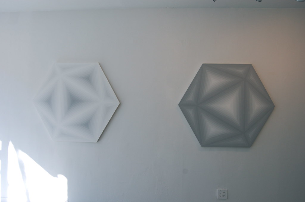
Left to right: David Malek, Inverse Icosahedron, 2011. Enamel on wood, 41 1/2 x 48 in.; David Malek, Obverse Icosahedron, 2011. Enamel on wood, 41 1/2 x 48 in. Photos: 16 Miles [more]
"Most ideas that are successful are ludicrously simple." — Sol LeWitt, "Paragraphs on Conceptual Art," 1967

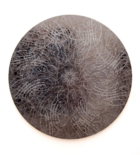
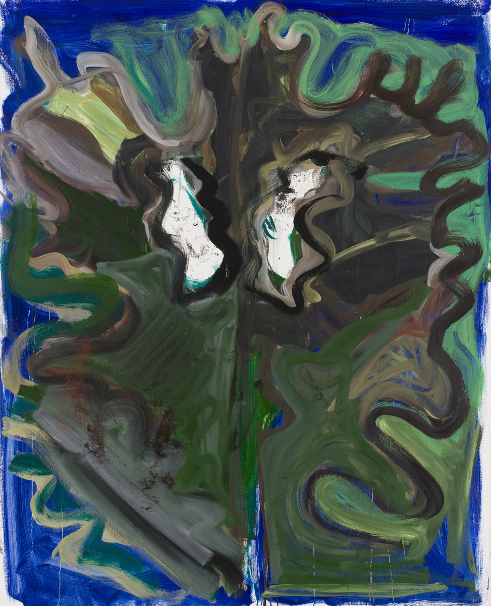
David Malek, Obverse Concentric Hexagon, 2011. Enamel on wood, 41 1/2 x 48 in.
Earlier this year, the Museum of Modern Art hung a handful of Frank Stella's classic early paintings in its heavily trafficked atrium. This was something of a surprise since that space has generally been the site of the museum's most theatrical and ambitious projects, the performance, video, and sculpture that simply would not fit anywhere else. It has become, as Times art critic Roberta Smith put it in December, "the billboard for the new, feisty radicality" in vogue at MoMA. The presence of Stella's paintings in that space is unusual, but it is, of course, radical in its own way, bringing an unexpected pause to all of that earlier spectacle and perhaps also acknowledging the influence that Stella's early works exercise on artists today, from Ned Vena to Xylor Jane. (It also signals that the institution apparently does not hold grudges: Stella famously declared that the 2001 MoMA exhibition "Modern Starts" should have been called "Masturbatory Insights" and subtitled "Pointless, clueless and soulless.")
One of the artists fruitfully using some of Stella's 1950s and 1960s magic is the Brooklyn–based artist David Malek, particularly in his current show, "Hexagons," at the new Wiliamsburg gallery Rawson Projects, which features six hexagonal canvases, each dated 2011. Malek has painted them with cascading lines of colors that range from white to dark gray and shift at a rate that corresponds to Albert H. Munsell’s color system, according to the press release. In Obverse Concentric Hexagon, this technique creates a painting that suggests a long look straight down the middle of a hexagonal tunnel from darkness to light; in Inverse Concentric Hexagon, the reverse. To Malek's credit, the analogy to Stella only goes so far. Another set of twins — Inverse Icosahedron and Obverse Icosahedron — conjures three-dimensions, contra-early-Stella, by dividing the hexagons into various triangles. Space expands outward and recedes inward as the eye travels, respectively, to the lighter and the darker stretches.
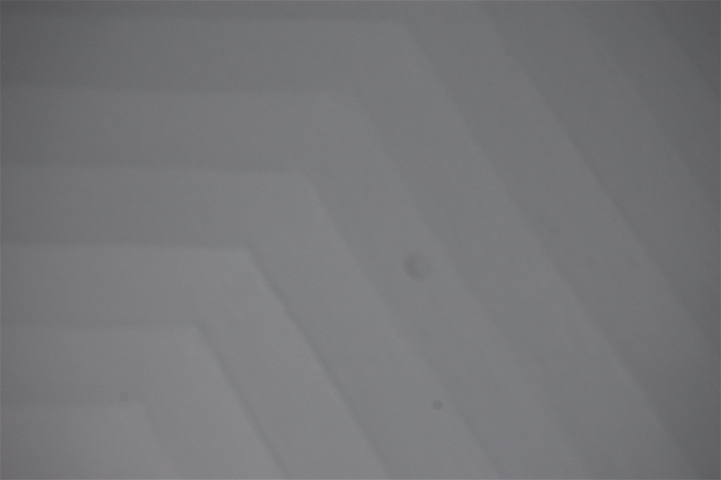
Detail view of David Malek, Obverse Concentric Hexagon, 2011. Enamel on wood, 41 1/2 x 48 in.
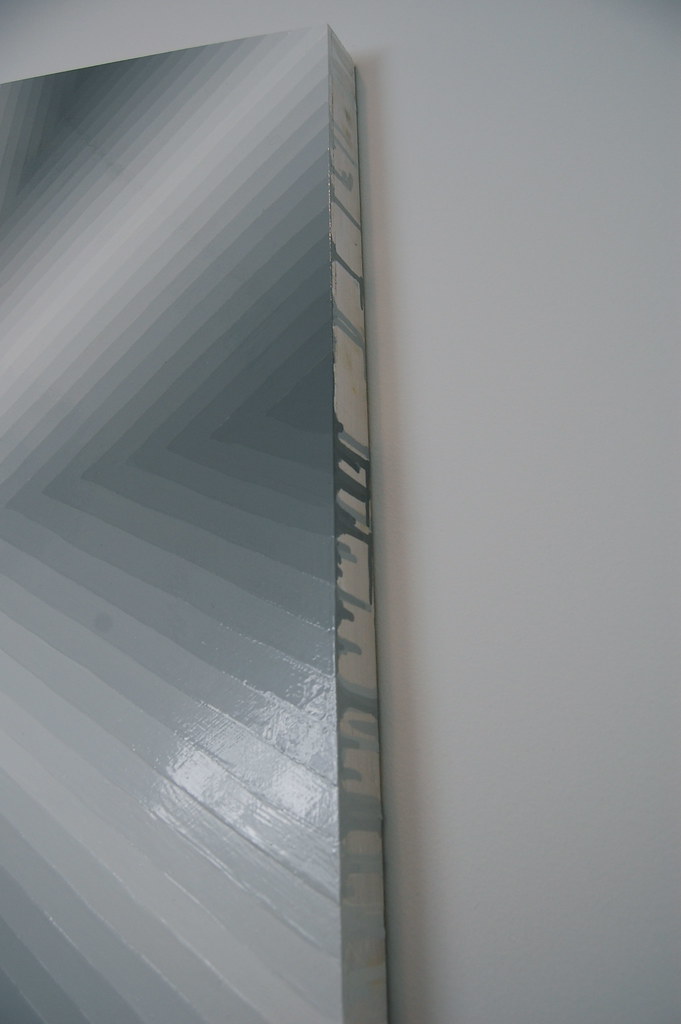
Detail view of David Malek, Benzene 2, 2011. Enamel on wood panel, 41 1/2 x 48 in.
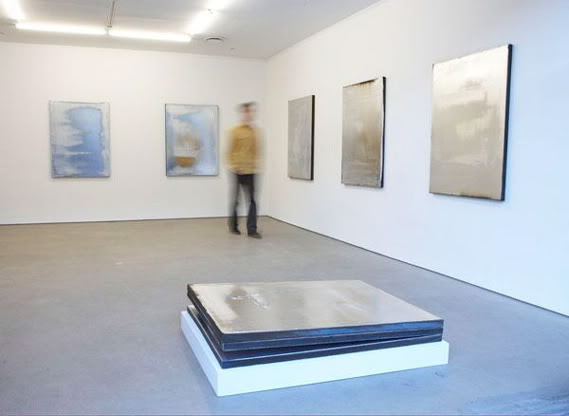
Seen together, the works possess a vaguely menacing quality, perhaps because of the uncanny doubling of the two pairs of canvases, and the fact that the remaining two works — a small one called Small Gray Icosahedron, hung low to the floor, and another large piece, Benzene 2, filled with six equilateral triangles (and named for a known carcinogen, the press release notes) — lack complementary partners. Noticing this, you may sense, as I did, an odd imbalance in the room, a crack in the group's otherwise perfect symmetry. As you look closer, other peculiarities appear, like a few errant paint drops on the shiny canvases or minute drips off their sides. What once looked logical, rational, and predetermined — a machine put in motion and set down out on canvas — begins to look strange, unfamiliar, fragile. Even as Malek is executing his rules, laying down hexagons mechanically, line by line, shade by shade, his system is coming apart.


